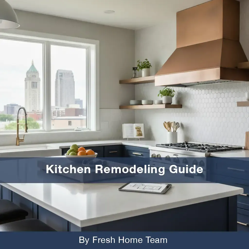
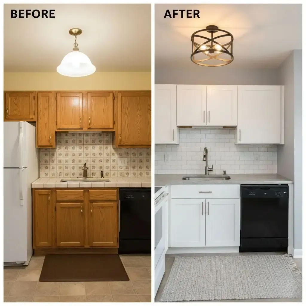
For years, the all-white kitchen reigned supreme, a symbol of clean, minimalist design. But as we move into 2026, homeowners are craving warmth, personality, and a deeper connection to the natural world. The kitchen is no longer just a sterile, functional space; it's the heart of the home, deserving of rich, soulful color.
Forget fleeting fads. The palettes of 2026 are all about creating timeless, inviting spaces that feel both modern and deeply comforting. If you're planning a renovation or just dreaming of a refresh, get ahead of the curve with these top 5 kitchen color palettes set to define the year.
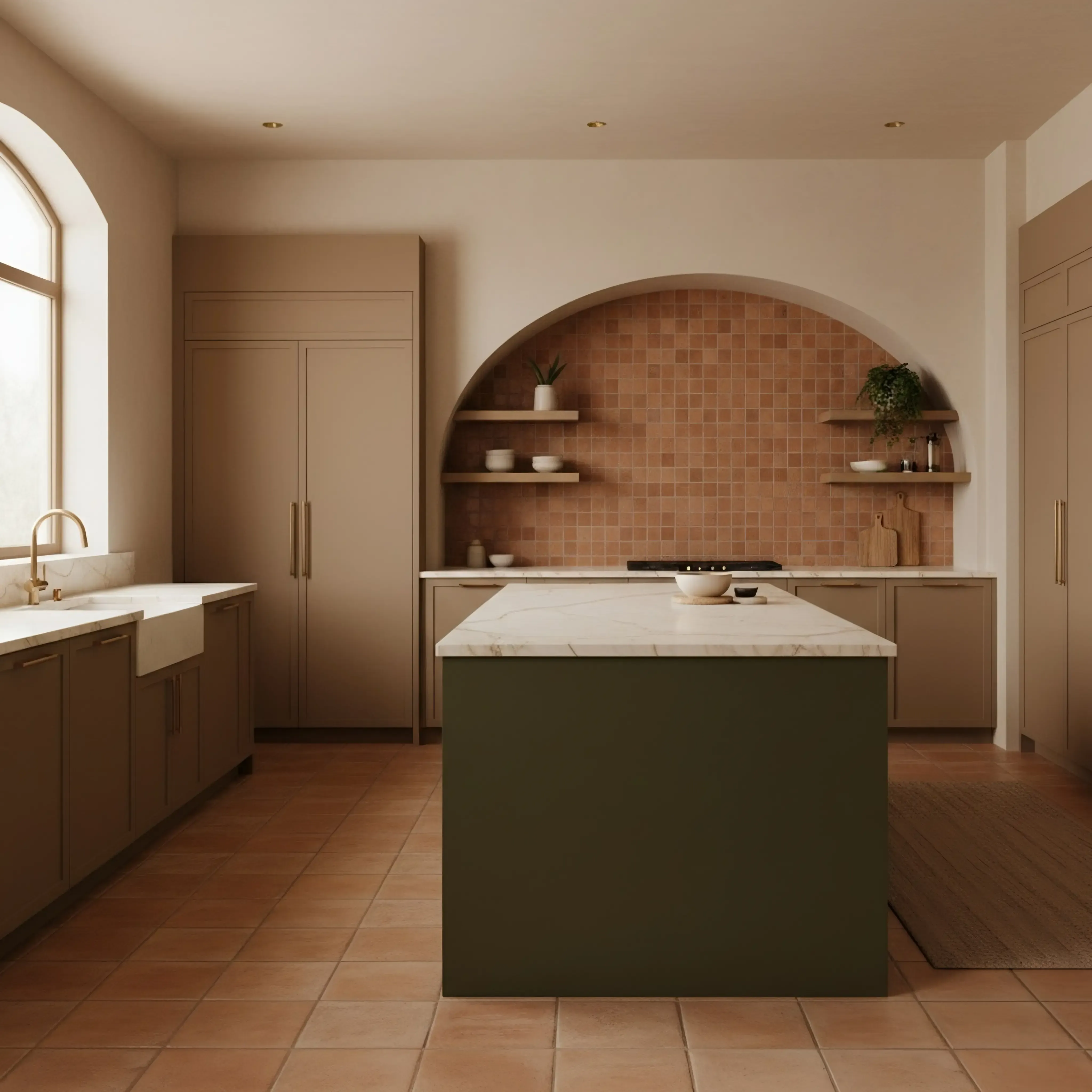
1. Grounded Luxury: Earthy & Organic
This trend takes the "back to nature" movement and elevates it with a touch of sophistication. It’s about creating a space that feels grounded, warm, and effortlessly chic. Think of a sun-drenched Mediterranean villa or a modern desert home.
- The Vibe: Warm, calming, and connected to the earth.
- The Palette: A rich mix of warm, mineral-inspired tones.
- Terracotta & Clay: Use this on a tile backsplash, a feature wall, or even as a bold choice for lower cabinets.
- Mushroom & Greige: The perfect sophisticated neutral for main cabinetry or walls. It's warmer than gray and more complex than beige.
- Deep Olive Green: A beautiful, grounding color for an island or a full set of cabinets.
- How to Use It: Pair mushroom-colored cabinets with a rich terracotta backsplash. Use warm wood tones (like walnut or rift-cut oak) for open shelving.
- Perfect Pairings: Unlacquered brass hardware, honed marble or quartzite countertops, textured zellige tiles, and plenty of natural light.
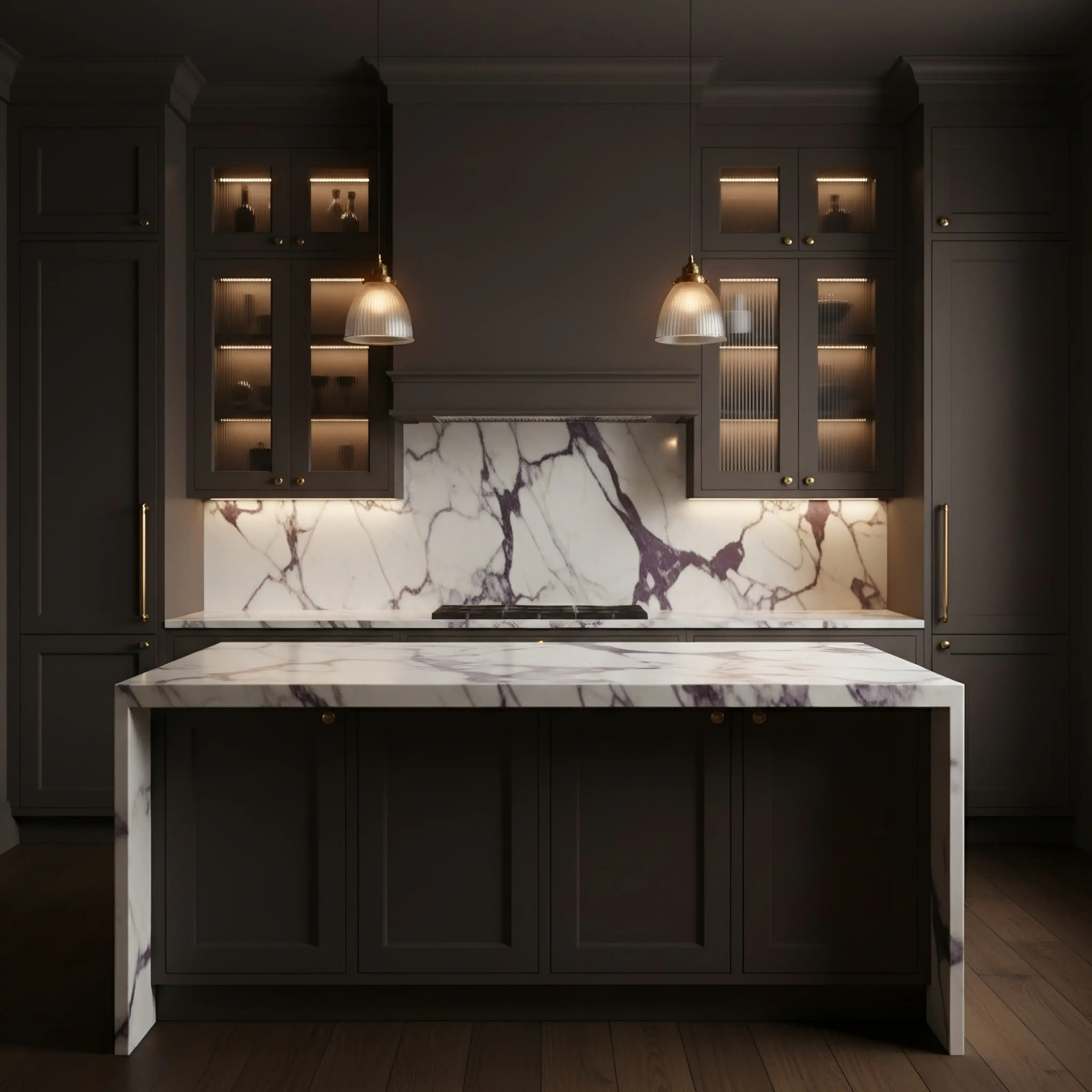
2. New Heritage: Moody & Enveloping
The dark and moody kitchen is maturing. In 2026, it’s less about stark black and more about deep, nuanced colors that create a cozy, enveloping feel. This palette is dramatic yet comforting, making a large kitchen feel more intimate or a small kitchen feel like a hidden gem.
- The Vibe: Dramatic, sophisticated, and intimate.
- The Palette: Deep, saturated colors that absorb light.
- Charcoal & Near-Black: A softer alternative to true black, often with a hint of brown or blue.
- Rich Chocolate Brown: A huge comeback color, bringing incredible warmth and depth to cabinetry.
- Inky, Muted Blues: Think deep navy that leans toward gray or green.
- How to Use It: Go all-in with chocolate brown cabinets and pair them with creamy white countertops and a matching slab backsplash for a seamless look. Use charcoal on the cabinets and warm wood on the island to break it up.
- Perfect Pairings: Polished nickel or aged brass hardware, dramatic veined stone countertops, reeded glass cabinet fronts, and strategic lighting (like sconces and under-cabinet LEDs) are essential.
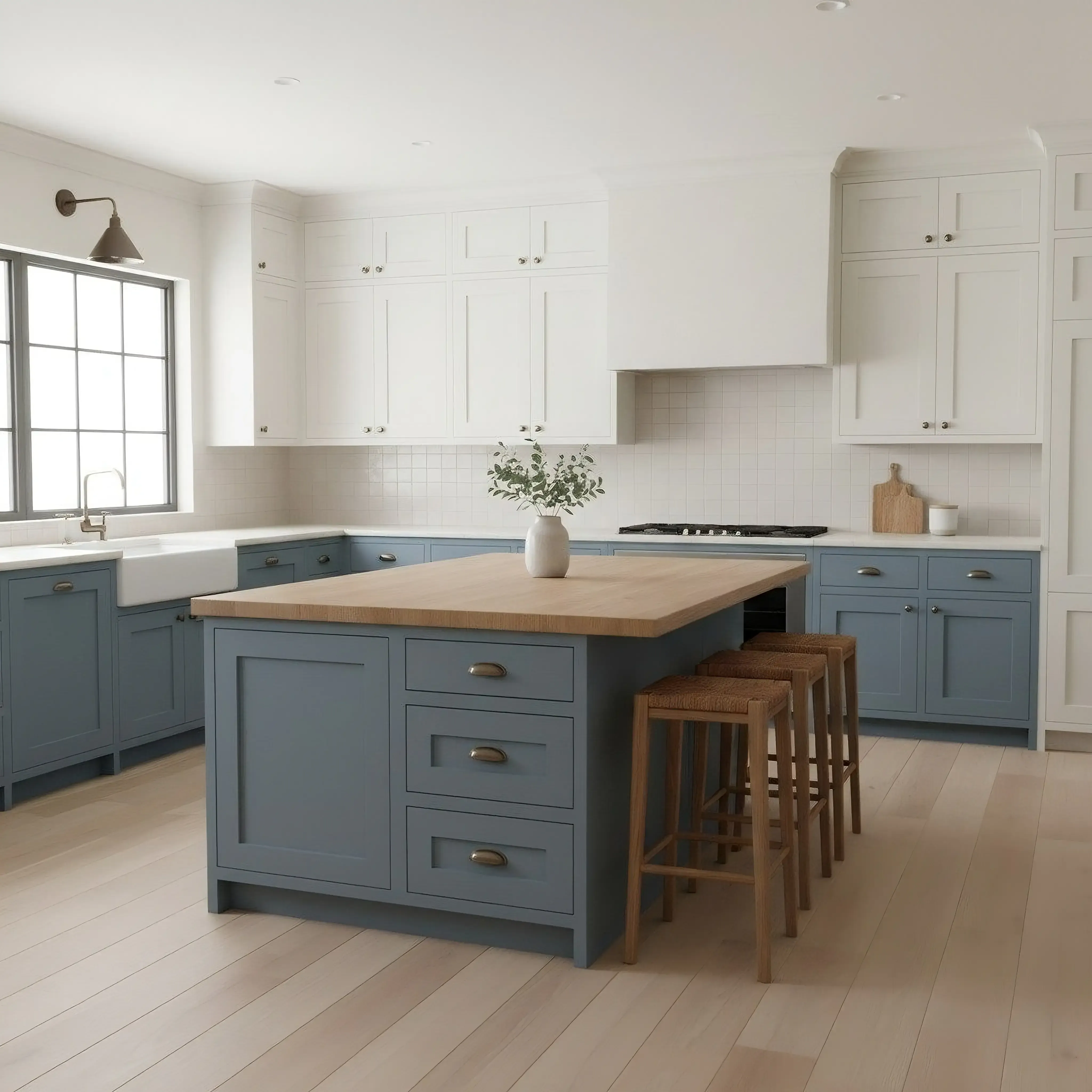
3. Pastoral Hues: Soft & Serene
A gentle reaction to years of bold, high-contrast design, this palette is all about soft, hazy colors that soothe the soul. It’s a modern take on the classic cottage or farmhouse kitchen, feeling airy, fresh, and subtly colorful.
- The Vibe: Calming, gentle, and nostalgic.
- The Palette: Washed-out colors inspired by a country garden at dawn.
- Dusty Blue: A timeless choice that feels both serene and classic.
- Buttery Yellow: Not bright lemon, but a soft, creamy yellow that acts as a cheerful neutral.
- Muted Sage & Moss Green: A perennial favorite that continues to feel fresh and organic.
- Hazy Mauve: A surprising newcomer, this dusty pink-purple hue adds a touch of warmth and personality without overwhelming.
- How to Use It: Paint all your cabinets in a soft dusty blue or sage. If you're hesitant, use a buttery yellow on the walls and keep the cabinets a warm white.
- Perfect Pairings: Light wood floors (like white oak), aged brass or antique bronze hardware, butcher block countertops, and simple ceramic tile.
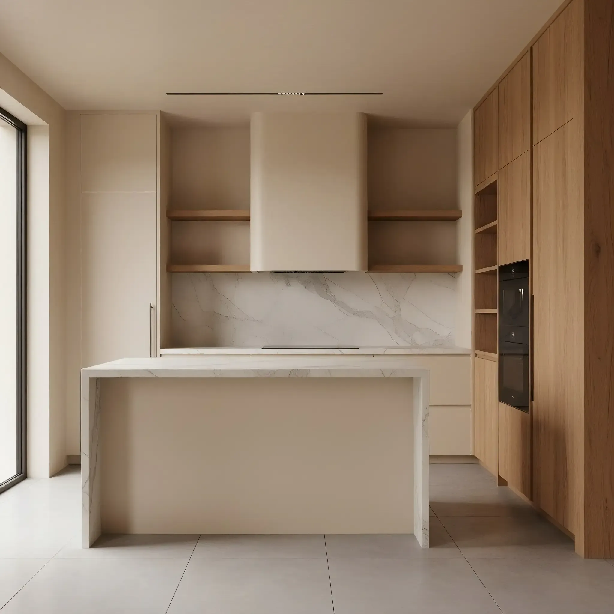
4. Warm Minimalism: The New Neutral
For those who still love a clean, uncluttered look, Warm Minimalism is the perfect evolution of the all-white kitchen. It maintains a light and bright feel but layers in soft, warm tones and rich textures to create a space that feels anything but sterile.
- The Vibe: Serene, sophisticated, and textural.
- The Palette: A tight, curated selection of warm off-whites and beiges.
- Cream & Alabaster: Softer and more inviting than stark white.
- Warm Taupe: A versatile neutral that bridges the gap between gray and beige.
- Cashmere: A soft, light gray with warm undertones.
- How to Use It: The key here is texture. Pair creamy cabinets with a plaster-finish range hood. Use the same warm stone for your countertops and backsplash for a seamless, monolithic look.
- Perfect Pairings: Rift-cut white oak, matte black or subtle bronze hardware, honed stone, and minimalist lighting fixtures. The focus is on materials, not color contrast.
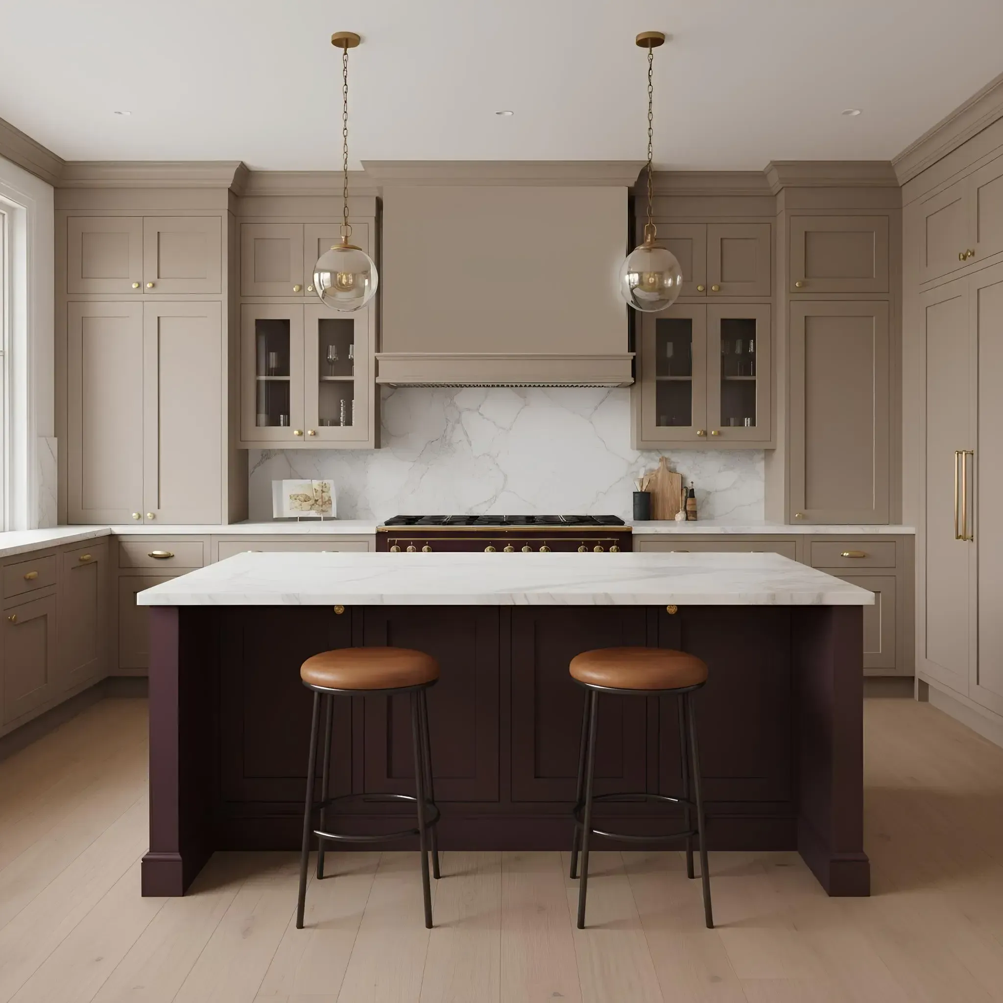
5. The Unexpected Accent: A Pop of Jewel Tone
While the overall palettes for 2026 lean towards natural and muted tones, there's a strong micro-trend of using a single, bold jewel tone as a powerful accent.
The Vibe: Confident, playful, and personal.
The Palette: A single, saturated accent color.
Deep Burgundy or Merlot: Incredibly rich and sophisticated for a butler's pantry, bar area, or kitchen island.
The overarching theme for 2026 kitchen colors is intention. It’s about choosing colors that make you feel good, whether that’s the calming embrace of a pastoral blue or the cozy drama of a deep charcoal. The all-white kitchen has had its moment; now is the time to let your personality shine through with a palette that truly feels like home.
Which color palette are you most drawn to?
Ochre: A deep, earthy yellow that adds a vibrant, spicy touch.
Plum: A moody, regal purple that pairs beautifully with both brass and black accents.
How to Use It: This isn't for your whole kitchen. Use it on a freestanding pantry cabinet, the inside of a glass-fronted cabinet, the bar stools, or even the range itself for a stunning focal point.
Perfect Pairings: Best used within an otherwise neutral palette (like Warm Minimalism or Grounded Luxury) to let the color truly shine.
The overarching theme for 2026 kitchen colors is intention. It’s about choosing colors that make you feel good, whether that’s the calming embrace of a pastoral blue or the cozy drama of a deep charcoal. The all-white kitchen has had its moment; now is the time to let your personality shine through with a palette that truly feels like home.
Which color palette are you most drawn to?!